The Symbolism Behind the UVES Logo

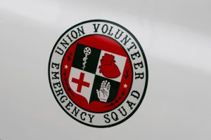
Every organization has its emblem, a visual representation that encapsulates its values and mission. For Union Volunteer Emergency Service (UVES), our logo holds a deep significance, reflecting our service to the community. Each element represents a founding value of UVES
A Proud Heritage
The UVES patch and decal were thoughtfully designed in 1973 by Bruce Shouty, a volunteer EMT and talented artist. Shouty’s creation pays homage to our history and represents various aspects that define our organization.
Green – A Color of Pride
Green has always been the color proudly worn by the UVES members. Symbolizing growth, renewal, and vitality, green reflects our commitment to the well-being and progress of the community we serve.
Western Style Lettering
The Western-style lettering in the logo is a nod to the geographical location of the UVES. As part of Western Broome County, UVES is based in the Town of Union, where we first began our invaluable work. The lettering signifies our origin and connection to the western part of Broome County.
Olive Branches – A Symbol of Peace and Assistance
Situated on either side of the logo are two olive branches, representing the UVES’ dedication to peace and providing help to those in need. These branches stand as a reminder that the organization is here to bring comfort, solace, and aid to individuals during emergencies.
Stars – Homage to the Town’s Villages
The two stars placed in the east and west positions within the logo are a tribute to the two villages located within the Town of Union. Serving both villages, UVES is committed to ensuring ensures that emergency services reach all corners of the region.
Medical Symbol and Red Cross
The medical symbol, featuring a tire with a wheel on top, signifies the mobile emergency services provided by UVES. Always ready to respond swiftly to emergencies, our ambulances are equipped with advanced life support technology, including paramedics, ensuring the highest level of care.
The inclusion of the Red Cross emblem pays homage to the organization’s early training days. UVES owes its foundational training in standard and advanced first aid, as well as CPR courses, to the American Red Cross. This symbol stands as a reminder of the strong partnership between UVES and the Red Cross, as well as the unwavering commitment to providing top-quality medical assistance.
Heart – A Symbol of Compassion
The image of a heart within the logo signifies UVES’s early specialization in addressing heart emergencies, such as heart attacks. As the organization evolved, our scope of services expanded to encompass advanced life support and paramedic care. The heart symbolizes our continued dedication to saving lives and ensuring the well-being of those in our care.
White Glove – A Helping Hand
The white-gloved hand depicted in the UVES logo serves as a visual representation of our commitment to reaching out and providing assistance to those in need. Just as a gloved hand offers reassurance and care, UVES extends our support, ensuring that no one faces emergencies alone.
The UVES logo is a testament to the rich history, values, and services provided by our organization. From our proud green color to the symbolism of peace, assistance, and dedication, each element within the logo tells a story of compassion, professionalism, and the pursuit of excellence. For over five decades, UVES has had the honor of being a vital lifeline for the Town of Union, and our logo stands as a powerful representation of our commitment to our community.